About the project
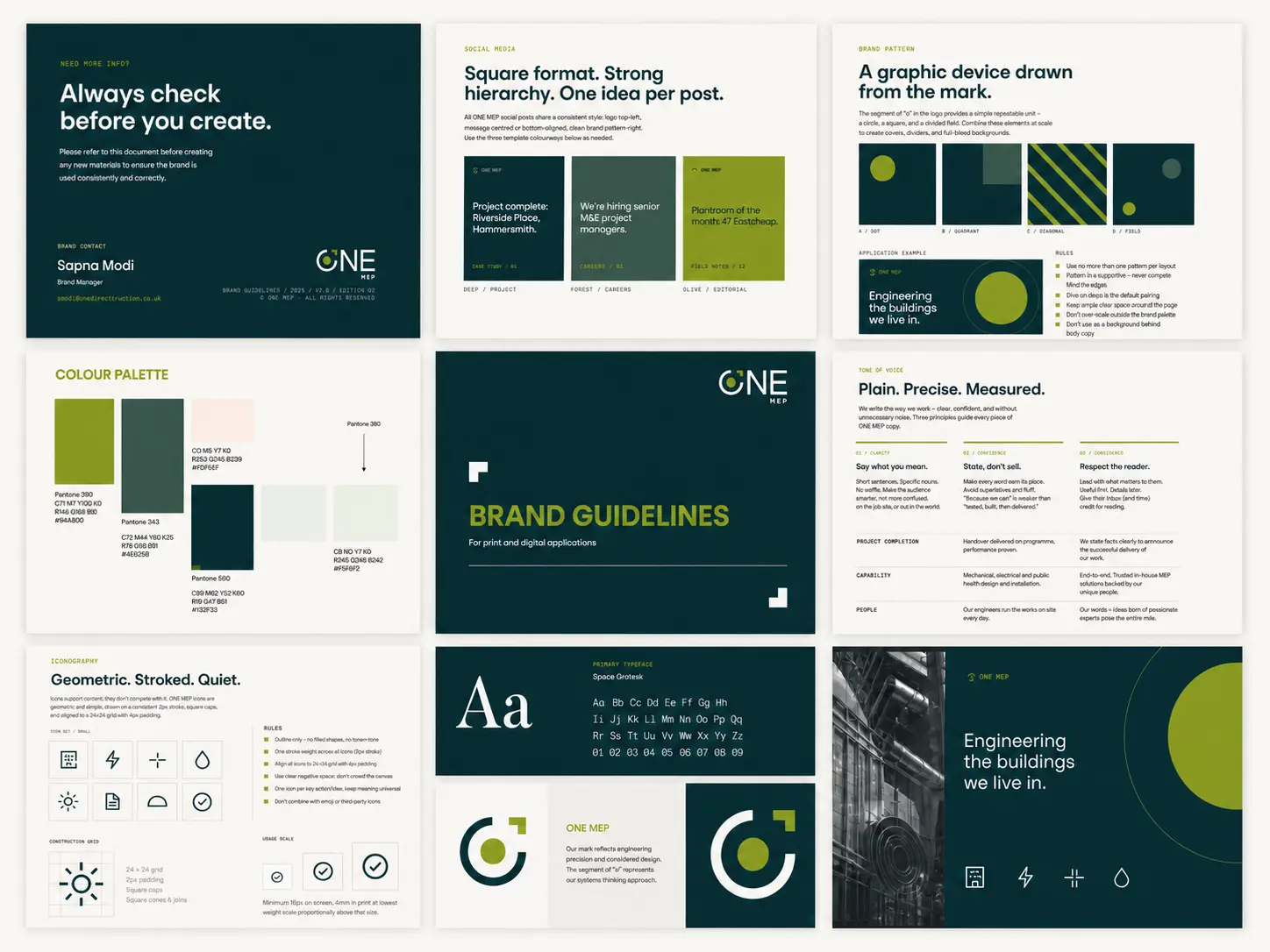
Creation of a brand identity for a newly formed MEP business within the RED Group. The brief was to establish a distinct identity that reflects the technical nature of mechanical, electrical and public health engineering, while positioning the business as clear, modern and integrated.
The concept centres around the idea of systems working together. The ‘O’ is designed as the focal point of the identity, inspired by a control interface or switch, representing activation, connectivity and performance. It subtly references how MEP sits behind the scenes, controlling how buildings function.
The circular form introduces a sense of continuity and flow, while the contrasting accent element acts as a signal point, highlighting precision and intervention within complex systems. The overall mark balances engineered structure with simplicity, creating something that feels both technical and accessible.
The identity was applied across all brand touchpoints, establishing a clear and consistent visual foundation from launch.
The commercial value was straightforward — a new business needs to look like one. A clear, confident identity gave the company the credibility to go to market, pitch for work and stand on its own.
Works include
- Brand identity
- Website design
- Visual language and assets
- Social media templates